Picture an immersive room on the morning it is handed over. The geometry is right. The resolution is correct to the last pixel. The brightness meets the figure written into the specification. Several projectors have been aligned and blended into a single surface so carefully that no eye in the room can find the seam between them. By every measure anyone thought to bring to the commissioning, the room is finished. And then the content runs, and something is wrong that nobody can quite name. The reds that were meant to be molten look like dull brick. The deep blue of a night sky turns to a flat, lifeless grey. Skin tones sit a shade off, wrong in a way the eye catches but the mind cannot place. The wide sunset that was designed to wrap the room and hold an audience perfectly still simply does not hold them. Everyone present signs the document, because every parameter they knew to test has passed. The one parameter that decided whether the room would move a person was never tested at all, because it was never specified. It is the colour the room can actually reproduce.
This is not an unusual outcome. On immersive rooms built around projection, it is closer to the rule than the exception, and the reason has very little to do with the equipment and almost everything to do with how it is chosen. A projector for an immersive room is almost always chosen on four parameters, which are resolution, brightness, contrast, and price, and it is judged a sound choice when those four are met. The colour it can reproduce, which is the parameter an immersive experience lives or dies by, sits outside that list, and so it is neither specified before purchase nor verified at handover. The room then performs exactly as well as the parameter nobody measured allows it to, which is to say unpredictably, and often poorly.
It is worth saying plainly, before going any further, that the projector is often the right instrument for this work. Direct-view LED has matured into a reliable and increasingly affordable default for flat, fixed surfaces, and where it fits, it is hard to argue against. But many immersive rooms are not flat, fixed surfaces. They are wraparound walls, domes, curved and irregular canvases, floors and ceilings turned into image, geometries too large or too strangely shaped for a tiled panel to cover at a price the project can bear. For these, projection remains the most economical and practical way to put light where it is needed. The projector decision, in such rooms, is the correct one. That is precisely why the parameter most often left out of the projector specification deserves the attention the rest of this piece gives it.
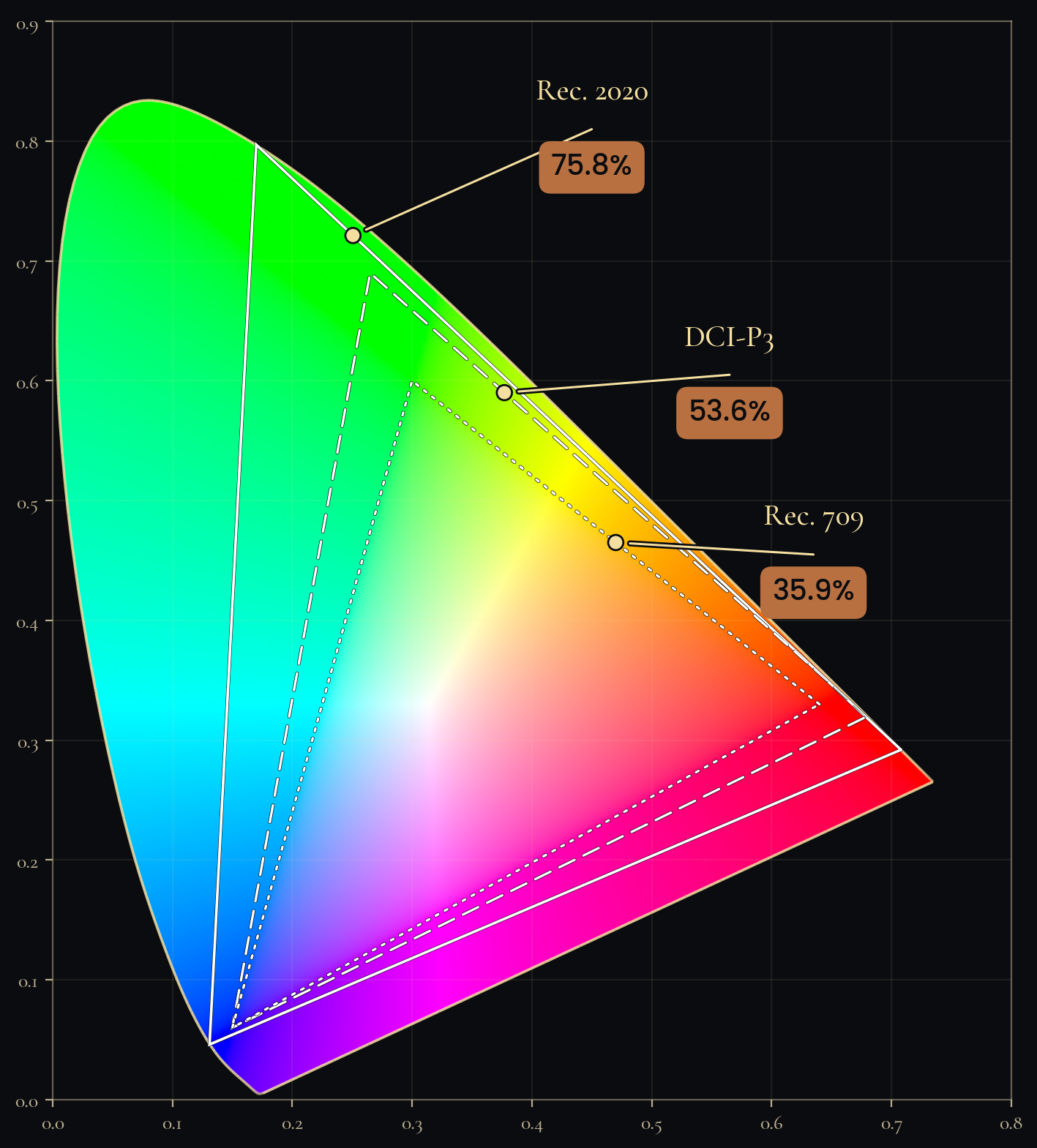
Colour gamut is a simpler idea than the language around it suggests. The human eye can see an enormous range of colour, and that full range can be drawn as a single territory. No device ever made can reproduce the whole of it; each can reproduce only a patch, and that patch is its gamut. So that content and equipment can speak the same language about which patch they mean, the industry has surveyed and named a few standard boundaries. There is Rec. 709, the modest boundary the world inherited from broadcast television, which most ordinary screens still live inside. There is DCI-P3, the noticeably wider boundary of the digital cinema, which carries the saturated reds and greens that television never could. And there is Rec. 2020, a boundary so wide that no affordable projector on the market today fully reaches it, and many that claim it reach only a part. That last fact is worth holding onto, because it is the quiet centre of the whole problem. A datasheet that says wide gamut, or names Rec. 2020 as though it were a box to be ticked, is almost never telling you how much of that boundary the projector actually fills.
What makes colour matter more in an immersive room than anywhere else is the nature of the room itself. On an ordinary display you look at a rectangle held in front of you, with the real world visible around its edges, and the eye forgives a great deal of colour inaccuracy because it has the rest of the room to correct against. An immersive image has no edges. It is the whole of what you see, and when colour fills the entire field of view the brain stops treating it as a picture and begins treating it as a place. Saturation and accuracy become, below the level of conscious thought, the cues by which the mind decides whether what it is seeing is real. A desaturated red or a clipped cyan does not register as the colour being slightly off. It registers as the place being false, and the presence the client paid for quietly collapses. And this parameter hides until the worst possible moment. Resolution and brightness announce themselves on the first line of a datasheet, where the eye naturally travels. Gamut sits lower down if it appears at all, and even then it says little, because it does not become real until actual content is thrown onto the actual surface, which is to say until the projector has already been chosen, bought, hung, aligned, and blended. The moment colour finally becomes visible is the moment it has become expensive to change.
There is a trap underneath the brightness figure, and it catches careful people. The lumens written on the box are almost always the lumens a projector produces in its brightest mode, and that mode reaches its number by sacrificing colour. It clips the gamut and pushes the white point of the image towards green, because green is where the eye perceives the most brightness for the least light. The fuller, truer gamut a projector is capable of is available only at a properly calibrated white point, and at a brightness materially lower than the headline. So a projector sold as both very bright and wide in colour may be entirely unable to be both at once, in the same mode, in the same room, on the same evening. The honest measure of a projector is therefore not a flat figure of gamut quoted on its own, but something closer to colour volume, which is the colour it can hold across its real range of brightness, because a wide gamut that survives only when the light is turned down to a glow is not a gamut any audience will ever see.
Where the gamut is truly decided is earlier than any setting, in the kind of light the projector makes before anyone has touched a menu. A lamp-based projector, built around the ultra-high-pressure lamp that dominated the industry for a generation, produces a limited gamut to begin with, and worse, an output that fades and drifts as the lamp ages, dimming markedly and losing its red faster than the rest, so that the room which looked one way at handover looks duller and subtly off in its colour by its third year, without a single setting having been changed. A laser-phosphor projector, which is where much of the market now sits, is brighter, far more stable over time, and wider in colour, though still bounded well short of the widest standards. A projector built on red, green, and blue lasers directly reaches the widest gamut available, approaching the boundaries the others only gesture at, though at the highest cost and with laser speckle to be engineered away. An LED projector offers genuinely excellent colour, held back by a ceiling on brightness that keeps it out of the largest rooms. The point of running through these is not to crown one of them. It is to show that the question of which projector is, underneath the surface, a question of which light, and that the conversation about colour has to begin there, rather than at the calibration stage, by which time the ceiling on what is possible has already been bought.
From all of this comes one idea simple enough to carry into any meeting, and it is the idea of a chain. Colour in an immersive room passes through a series of links, and the experience can be no better than the weakest of them. It begins with the colour space the content was mastered in. It passes to the gamut the projector can reproduce at the brightness and white point the room will actually be run at. It passes to the screen or the surface the light lands on. It ends in the ambient light of the room itself. Content mastered for the wide colour of the cinema, shown on a projector that can only reach the narrow boundary of broadcast television, has lost its intent before it has begun. A projector capable of wide colour, run in the clipped bright mode that flatters a showroom floor, has thrown its own advantage away. Either of them, in a room where stray light washes across the surface, has lost the colour a third time. The single question worth putting to any immersive room, then, is not how bright it is. It is what colour it can actually reproduce, under the conditions in which it will be run, and whether the content has been made to match.
The natural question is why an industry of capable people specifies the parameter that matters least and omits the one that matters most. There are three reasons, and not one of them is the fault of any individual. The first is that the training and the specification habits of the audio visual industry are built around the loud, legible numbers of resolution, brightness, and contrast, and colour gamut has never been a standard line on the buying checklist, so most of the people who write specifications were never taught to ask for it. The second is that on the rare datasheet where gamut does appear, it does so as a marketing claim with no conditions attached, a bare mention of a standard with no statement of how much of it is covered or at what brightness and white point that coverage holds, so that even a diligent buyer is handed nothing they can act on. The third, and the most consequential, is that nothing in the way these rooms are bought has ever required the parameter to be proven. Alone among the specifications, it is assessed only subjectively, after the room is finished, when the single remaining option is to be disappointed, because no standard, no contract, and no line on a checklist compels anyone to put it on paper beforehand. That is the gap. And the person with the most to lose from it, and therefore the most reason to close it, is the client, who can do so with nothing more than a question asked before the contract is signed.
A fair objection waits here, and meeting it matters, because everything said so far could be misheard as a call to buy the widest possible colour at any price. It is not. Not every immersive room needs the widest gamut, and for some, reaching for it would only waste the client's money, because the content that will play in them could never carry that much colour in the first place. The right gamut is not the largest one. It is the one matched to the content that will actually run, the surface it will run on, and the intent of the experience being built. The discipline this piece argues for is not maximum saturation; it is deliberate specification, which means choosing a colour target against the real content chain, and stating the conditions under which the projector must meet it, before anything is bought. To over-specify is to spend on colour the content will never show. To under-specify is to kill, quietly and irreversibly, the experience the room was commissioned to create. The instrument is the matched specification, agreed in advance, and not a number chased after the fact when nothing can be done with the answer.
It is worth being clear about whose parameter this really is. It is the client's. It is the client's experience, the client's audience, and the client's name on the room that depend on whether it creates presence or merely fills a wall with bright light. Colour is the variable that decides between those two outcomes, and it is the one most easily left out of a specification precisely because it is the one least visible until the moment it is too late to change. A client who understands it walks into the commissioning meeting able to ask a different question from the one everyone else is asking. Not whether the image is bright enough, which it almost always is, but what gamut the projector holds at the white point at which the room will run, and whether the content has been mastered to match it. A client who can ask that question cannot be handed a room that looks impressive on a datasheet and falls flat in the dark.
In the cinema, in broadcast, in every field where colour is part of what is being sold, the people who commission the work decided long ago that colour was too important to leave unmeasured. The immersive experience, which asks more of colour than any of them because it surrounds the viewer completely, has not yet been required to make the same decision, and until the field requires it, the decision falls to the client to make, by asking for the one parameter the brief leaves out. The question to settle before the next immersive room is contracted is not how bright the projectors will be. Brightness fills the wall and resolution sharpens it, but neither makes the room real. Colour is the architecture of presence, and it is there for any client willing to ask for it.